Hello there friends, I've been playing around with some pages and not yet added any text, perhaps I won't as I really like the way the pages look now.
With this first page I was going for an all white look which ended up being pearl and gold, but you know how these things just flow and what you set out to do sometimes takes an unexpected turn. I've used gesso and then some trim string and lace dasies and butterflies. The pages were painted with a irridescent paint finish which turned the stark white of the gesso to a rich pearly sheen. I thought I'd just add a little bit of colour with some Gold.
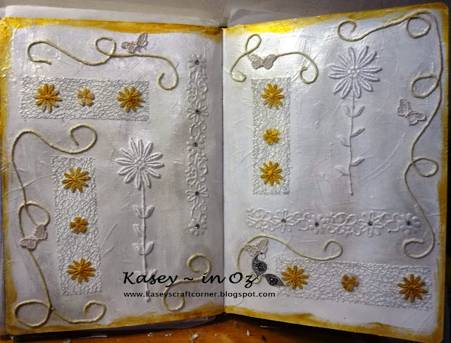
This next page is an acrylic paint background, with gesso over the top to soften and blur the edges, then a thick layer of crackle paint and stormy sky distress ink rubbed over the crackle. I then added the texture paste and stood back and looked at it and thought it looked like a fancy trellis so then came the idea of using up some of my flower stash. a little bit of lace and some awesome bling. Page done!
 With this close up of the bling, you can also see the gorgeous texture of the crackle paint. I'm really super happy with this spread.

Thank you for taking time to stop by for a visit.
Cheers,
Kasey
With this first page I was going for an all white look which ended up being pearl and gold, but you know how these things just flow and what you set out to do sometimes takes an unexpected turn. I've used gesso and then some trim string and lace dasies and butterflies. The pages were painted with a irridescent paint finish which turned the stark white of the gesso to a rich pearly sheen. I thought I'd just add a little bit of colour with some Gold.

This next page is an acrylic paint background, with gesso over the top to soften and blur the edges, then a thick layer of crackle paint and stormy sky distress ink rubbed over the crackle. I then added the texture paste and stood back and looked at it and thought it looked like a fancy trellis so then came the idea of using up some of my flower stash. a little bit of lace and some awesome bling. Page done!


Thank you for taking time to stop by for a visit.
Cheers,
Kasey


